If you searched for “high level CRO techniques,” you want the few changes that create real lifts fast. Here are the five that move revenue the most on service websites: a sticky CTA footer that is always visible, a distraction free header that reduces leaks, forms that feel easy with a WhatsApp alternative, a low risk first step offer, and proof placed exactly where decisions happen. Implement these and you can see a step change without rebuilding your site.
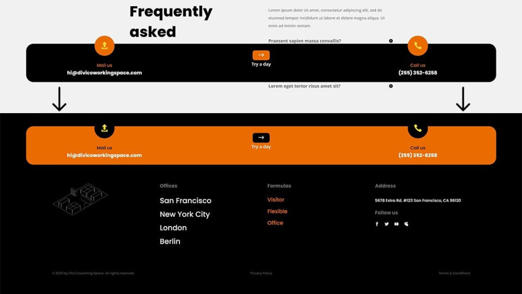
1) Sticky CTA footer that never disappears
What it is
A persistent bar anchored to the bottom of the screen on mobile and desktop that carries one primary action. Example: “Get a Free Audit” or “WhatsApp Us Now.”
Why it works
Attention moves. If the action is always one tap away, you catch intent the moment it spikes. This can lift conversion on long pages and on mobile where the main button scrolls out of view.
How to do it well
- Keep it single purpose: one button only.
- Match the promise to the hero headline. Do not introduce a new offer here.
- Add light reassurance under the label: “Reply in 1 business day.”
- Trigger a short slide in after 3 to 5 seconds or at 50 percent scroll so it feels helpful, not pushy.
- Make it thumb friendly: at least 44px height on mobile.
Common mistakes to avoid
- Two buttons fighting each other.
- Hiding it on pages that get most of your traffic.
- Letting it cover chat widgets or form fields. Test on small screens.
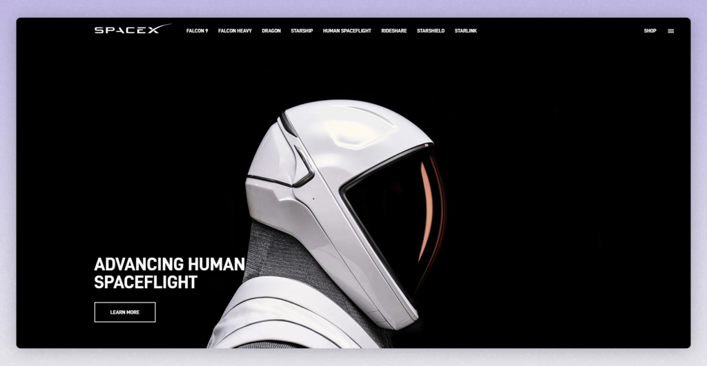
2) Distraction free header that reduces leaks
Goal
Cut the number of exits that do not help a buyer reach a decision. Your landing pages should be focused. Your main site can stay navigable but still prioritize the CTA.
What to keep on landing pages
- Logo that links home
- One primary CTA button
- A simple phone or WhatsApp icon if you take calls
- An About or Reviews link for trust, placed in the footer or in a light secondary menu
What to remove
- Dropdowns with 8 links
- Blog and Careers in the top nav
- Social icons that send people away
Micro improvements
- Use a compact “sticky on scroll” header so the CTA follows the user without taking space at the top.
- Make the CTA label action oriented: “Get Pricing” or “Start My Audit” over “Contact.”

3) Optimized forms with a WhatsApp option
Why this matters
Some people never fill forms. Giving them a direct channel increases total leads without hurting form volume.
Best practice pattern
- Two step form: Step 1 asks for name, email, website. Step 2 asks qualifying questions.
- WhatsApp fallback under the button: “Prefer WhatsApp? Tap here.” Preload the chat with context like name and site URL.
- Inline trust: “Private. No spam. We reply within 1 business day.”
Friction you can remove today
- Kill “How did you hear about us” on Step 1. Track it in analytics instead.
- Use smart defaults and input masks for phone numbers.
- Show an honest success state: a real thank you page that confirms details and sets expectations.
Quality controls
- If you get low intent WhatsApp pings, add a tiny gate: “Share your site so we can review” in the prefilled message.
- Route WhatsApp to a single number with business hours in the auto reply.
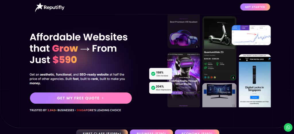
4) A low risk first step offer
Reason it drives big wins
Most service pages ask for a big commitment too early. A safer first step increases yes rates while keeping lead quality high.
Offers that convert
- Free mini audit with a short Loom video and 3 actionable fixes
- Live teardown call with before and after examples
- Paid diagnostic credited to project kickoff
- “7 day design spec” for complex builds with a clear deliverable
Risk reversal copy you can paste
- “If you do not get at least 3 specific recommendations you can act on immediately, you do not pay.”
- “If we are not the right fit we will tell you, and point you to a better option.”
Where to place it
- Hero, above the fold
- Inside the sticky footer
- After your first proof section
- On the thank you page as a next step
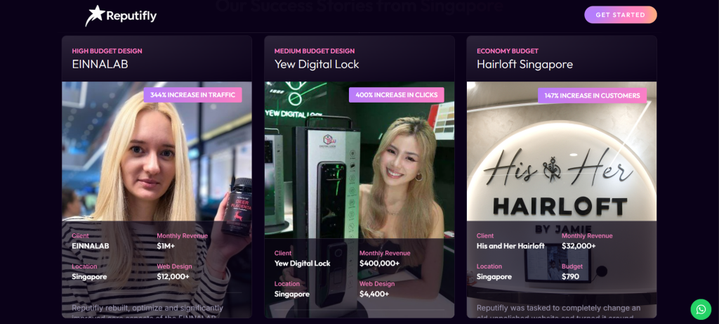
5) Proof where decisions happen
Move beyond vague claims
Buyers believe numbers, names, and recency. They do not believe “trusted by many.”
Build a proof stack
- Star rating and count with timing: “4.9 from 187 reviews, updated this month”
- 2 to 3 short case snapshots: problem, action, outcome, and a client quote
- Named logos grouped by vertical: “Legal, Home Services, Health”
- Before and after visuals placed near the form
Placement that matters
- Right beside the first CTA above the fold
- One more proof cluster mid page before pricing
- One last cluster just above the final CTA
Copy example
- “Local clinic lacked leads. We rebuilt the hero, simplified the form, and added a WhatsApp option. Qualified enquiries rose 64 percent in 30 days.”
Bonus: Speed and mobile performance
It will not 5x a great page on its own, but a slow site quietly kills conversions. Aim for LCP under roughly 2.5 seconds, minimal layout shift, compressed images, and lean fonts. Keep the first CTA visible without scroll on modern phones, then let the sticky footer do its job.
Quick wins checklist
- Sticky CTA footer shows one action, thumb friendly, live on every money page
- Header trimmed to logo, primary CTA, and optional phone or WhatsApp
- Two step form with WhatsApp fallback and a clear thank you page
- Low risk first step offer named and repeated in all CTA locations
- Proof clusters with numbers and names placed above the fold and near pricing
- Bonus: speed tuned for mobile with a visible first CTA