A landing page is not just a webpage. It is a persuasion machine. Every element — from the headline to the button color to where you place your form — either moves a visitor toward converting or pushes them away.
The best landing pages do not succeed by accident. They are built on well-documented psychological principles that influence how people make decisions. Understanding these principles is the difference between a page that converts at 2% and one that converts at 15%.
Here is what the science says — and how to apply it to your landing pages right now.
The Cognitive Biases That Drive Conversions
Anchoring: Set the Frame Before the Ask
The first piece of information a visitor sees becomes their reference point for everything that follows. This is anchoring, and it is one of the most powerful biases in pricing and persuasion.
Show the full price before the discounted price. Display your premium package first, so the mid-tier looks like a deal. If your service saves clients $50,000 a year, state that before revealing your $5,000 fee. The anchor makes everything after it feel proportionally smaller or larger.
On landing pages, your headline is your first anchor. If you open with a big, specific benefit (“Our clients average 340% ROI in 6 months”), everything else on the page is evaluated against that frame.
Social Proof: We Follow the Crowd
Humans are herd animals. When we are uncertain, we look at what others are doing. This is why Amazon shows reviews, why restaurants display queues, and why your landing page needs visible evidence that other people have already said yes.
The most effective forms of social proof for landing pages: specific testimonials with names and results, client logos, user counts (“Join 2,000+ Singapore businesses”), case studies with measurable outcomes, and trust badges from recognized organizations. Place social proof near your CTA — that is where doubt peaks and where reassurance has the most impact.
Scarcity and Urgency: Act Now or Lose Out
When something is limited, we want it more. This is not manipulation — it is human wiring. Scarcity triggers loss aversion, which is psychologically about twice as powerful as the prospect of gaining something equivalent.
Use genuine scarcity on your landing pages: limited-time offers with real deadlines, limited spots for services or consultations, countdown timers for promotions, low-stock indicators for products. The key word is genuine. Fake scarcity destroys trust the moment a visitor catches on. If your “limited offer” has been running for 6 months, it is not scarcity — it is dishonesty.
Loss Aversion: Fear of Missing Out Beats Desire for Gain
People are roughly twice as motivated to avoid losing something as they are to gain something of equal value. This has massive implications for how you frame your landing page copy.
Instead of “Gain 50% more leads,” try “Stop losing 50% of your potential leads.” Instead of “Save $500,” try “Stop wasting $500 every month.” The information is identical, but the loss-framed version triggers a stronger emotional response. Use loss aversion in headlines, subheadlines, and CTA button text for maximum impact.
For more on conversion-focused strategy, read Maximize Conversions, Not Clicks.
Visual Hierarchy: Guiding the Eye
The F-Pattern and How to Use It
Eye-tracking studies consistently show that people scan web pages in an F-shaped pattern: they read across the top, scan down the left side, and occasionally read across again mid-page. The bottom-right of your page is essentially a dead zone.
Design your landing page accordingly. Place your most important headline at the top. Put key benefits along the left side. Place your CTA where the eye naturally pauses — at the end of horizontal scan lines, not tucked into a corner nobody looks at.
Size, Color, and Contrast
The visual weight of an element determines how much attention it gets. Your CTA button should be the most visually prominent element on the page. Make it large, use a high-contrast color that appears nowhere else on the page, and surround it with whitespace.
Your headline should be the largest text. Subheadlines should be noticeably smaller. Body text should be comfortable to read (16px minimum on desktop, 18px on mobile). This hierarchy tells visitors what to read first, second, and third without them having to think about it.
Above-the-Fold Essentials
The content visible before scrolling (above the fold) has roughly 80% more engagement than content below it. This is prime real estate, and most businesses waste it.
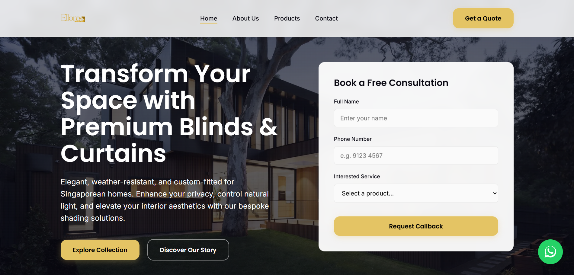
Your above-the-fold section must contain: a clear, benefit-driven headline; a supporting subheadline or brief description; a primary CTA button; a relevant hero image or video thumbnail; and at least one trust indicator (client logo bar, review stars, or a brief testimonial).
What does not belong above the fold: lengthy paragraphs, multiple competing CTAs, navigation menus with 10+ items, or generic stock photos that add nothing. Every pixel above the fold should earn its place by moving the visitor toward conversion.
Form Placement and Design Science
Where you place your form matters as much as what fields it contains. For high-commitment offers (consultations, demos, quotes), the form works best embedded directly on the page rather than behind a button click. For lower-commitment offers (downloads, newsletter signups), a button that scrolls to or opens the form performs well.
Key form design principles: keep fields to the absolute minimum (name and email for lead magnets, add phone for consultation requests). Use a single-column layout — multi-column forms confuse users. Make the submit button descriptive (“Get My Free Audit” not “Submit”). Place social proof directly above or beside the form to reassure visitors right at the moment of commitment.
If you need more fields, use multi-step forms that show progress. Breaking a 6-field form into two 3-field steps can increase completion rates by 40% or more.
Color Psychology on Landing Pages
Color affects emotion and behavior, but not the way most articles claim. There is no universally “best” button color. What matters is contrast and context.
Your CTA button should use a color that contrasts sharply with your page background and is not used anywhere else on the page. If your brand colors are blue and white, an orange or green CTA button will stand out. If your page is dark, a bright button draws the eye.
Beyond buttons, use warm colors (red, orange, yellow) to draw attention to urgency elements and trust badges. Use cool colors (blue, green) for body text backgrounds and information sections — they feel stable and trustworthy. Consistent color usage across your web development builds subconscious trust.
Trust Architecture: Building Credibility Layer by Layer
Trust is not a single element — it is an architecture built throughout the page. Each trust signal reinforces the others, creating a cumulative effect that moves visitors from skepticism to confidence.
Layer your trust signals strategically: brand logos and trust badges at the top for immediate credibility. Specific testimonials with measurable results in the middle section. Case studies or detailed social proof near the CTA where doubt peaks. Guarantees, security badges, and privacy assurances near the form or checkout.
The goal is that no matter where a visitor is on the page, there is a trust signal within their immediate view. Doubt should never have a chance to build without being countered by evidence.
Headline Formulas That Actually Convert
Your headline is the single most important piece of copy on your landing page. Research from advertising legend David Ogilvy suggests that five times as many people read the headline as the body copy. If your headline fails, nothing else matters.
Formulas that consistently perform well:
- The Specific Result: “We Generated 847 Qualified Leads for [Client] in 90 Days”
- The Problem-Agitate: “Tired of Paying for Clicks That Never Convert?”
- The How-To: “How Singapore SMEs Are Cutting Ad Costs by 60% (Without Losing Leads)”
- The Direct Benefit: “Get More Qualified Leads From Your Existing Traffic”
Notice what these all have in common: specificity and clear benefit. Vague headlines tell the visitor nothing and give them no reason to keep reading.
Video vs. Static Hero: Which Converts Better?
The answer depends on your product, audience, and execution. For complex services or products that benefit from demonstration, a short (under 60 seconds) hero video can increase conversions by 20 to 80%. For straightforward offers, a strong static image with clear copy often performs equally well or better.
If you use video: keep it short, include captions (most people watch without sound), show results or the product in action, and always have a CTA visible alongside the video — never make visitors wait until the video ends to take action.
If you use a static hero: choose an image that shows the outcome or benefit, not just your product. A photo of a happy client is better than a photo of your office. An image showing results on a screen is better than a generic handshake photo.
Whatever you choose, make sure it does not slow down your page. A beautiful hero video that adds 4 seconds to your load time will cost you more conversions than it gains. This is where working with a strong web development team pays off.
Pairing Landing Pages With Paid Ads
A landing page does not exist in isolation. Its effectiveness depends heavily on the traffic source. If you are running Google Ads, your landing page must match the ad’s promise exactly. If someone clicks an ad for “free SEO audit,” they should land on a page about your free SEO audit — not your homepage, not your services page.
This is called message match, and it is one of the most important factors in landing page conversion rates. Mismatched messaging between ad and landing page is one of the top reasons for poor Quality Scores and low conversion rates in paid campaigns.
Frequently Asked Questions
What makes a landing page high-converting?
A high-converting landing page combines a clear value proposition, strong visual hierarchy, psychological triggers (social proof, scarcity, loss aversion), minimal distractions, a prominent CTA, trust signals, and fast load speed. Every element should serve the single goal of getting the visitor to take one specific action.
How many CTAs should a landing page have?
One primary CTA, repeated multiple times throughout the page. All buttons should lead to the same action. Multiple different CTAs on the same page create decision paralysis and reduce conversions. Pick one goal per landing page.
What is the best landing page length?
It depends on the complexity and cost of your offer. Low-cost, simple offers (ebook download, newsletter signup) work best with short pages. High-cost, complex offers (consulting services, enterprise software) need longer pages that address more objections and build more trust before asking for commitment.
Should I use a navigation menu on my landing page?
For dedicated campaign landing pages, no. Removing navigation keeps visitors focused on the single conversion goal and can increase conversions by 20 to 30%. For landing pages that are also regular website pages (like a services page), you can keep a simplified navigation but make the CTA more prominent than any nav element.
Build Landing Pages That Actually Convert
Psychology-driven design is not about tricking people. It is about understanding how people naturally make decisions and designing your pages to work with those patterns instead of against them. When your landing page aligns with how the brain processes information and evaluates trust, conversions happen naturally.
If your current landing pages are underperforming, the fix is usually not more traffic — it is better page design grounded in these principles.
Talk to our team about building landing pages that turn your ad spend into actual revenue. We combine conversion psychology with data-driven design to create pages that perform.